
When designing a hero section in Webflow, one of the most common requests is having a full-screen background image that stretches to cover the entire viewport. This creates a bold, immersive first impression for visitors. Here’s how you can achieve it step by step.
Step 1: Add Your Background Image
- Select the section you want to style (for example, section-hero).
- In the Style panel, scroll to the Backgrounds section.
- Click Choose Image and upload or select your image.
- Set the Background Size to Cover and Position to Center Center.
- This ensures the image scales proportionally while always covering the full area.
Step 2: Set the Section to Full Height
By default, sections may only expand as far as their content. To make your hero section fill the whole screen:
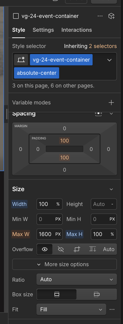
- With the section selected, go to the Style panel → Size.
- Set the Height to 100vh.
- “vh” stands for viewport height. 100vh means the section will always be as tall as the browser window, regardless of screen size.
Step 3: Adjust Layout and Spacing
- Make sure the Width is set to 100% so the image spans edge-to-edge.
- Remove unnecessary padding or margins that might reduce the section height.
- If you’re adding text or buttons inside the hero, use Flexbox or Grid to keep content centered both vertically and horizontally.
Why This Matters
Using a full-height hero background sets the tone for your website instantly. It helps create a professional, modern look while keeping the focus on your main headline or call-to-action.
Whether you’re showcasing a product, event, or creative project, this approach ensures your visitors are immediately engaged with a strong visual.